
Celebrate Your Story on Canvas – One Memory at a Time
Whether it's a milestone, a memory, or a simple joy, we’re here to make it a lasting part of your home.
-

Add Photos
-

We Deliver
-

You Stick


Or Select From Our Wide Range of Collections
Turn your favorite phone pics into prints that stick and restick.
They’re removeable, reusable, and leave no marks.
How it Works
-

1
Upload a photo or choose from our canvas
-

2
The art is printed and shipped to you


Happiness Guaranteed

Reviews That Made Our Day
Up to 40% off + Free Shipping
“I was impressed with the quality of the canvas prints from Prints4Sure. The colors are vibrant, and the image clarity is excellent—true to what I uploaded. The materials feel durable, and they arrived in perfect condition.”

“I love that I can rearrange them without damaging my walls, and they’re perfect for renters or anyone looking for a hassle-free personal story décor solution. They adhere well and are easy to reposition."
“I wanted to create a keepsake for my grandparents’ 50th wedding anniversary. I uploaded a photo from their wedding day and added one from a recent family gathering for a ‘Then and Now’ theme. The detail was beautiful, and it was so clear despite the older photo."
“I recently got married, and my husband and I ordered a large canvas of our favorite wedding photo from Prints4Sure. When it arrived, I almost cried—everything looked stunning, from the clarity of our faces to the warmth of the colors."
-

Rated 4.9 on the Appstore
Based on 80,000+ Reviews
-

-

Rated Excellent on Trustpilot
Based on 10,000+ Reviews


10 Creative Ways to Design Stunning Walls with Square Photo Prints
Square photo prints have quietly become one of the most versatile and visually satisfying tools in home decoration. Their equal dimensions create a natural sense of balance that rectangular prints simply cannot replicate, and this symmetry makes them far easier to arrange on a wall without the composition feeling accidental or chaotic. Whether you live in a compact apartment or a sprawling family home, square prints give you the flexibility to fill any wall space in a way that looks intentional and professionally styled. The growing popularity of square formats has also been driven by social media culture, where square images became a standard, and people began printing those images in the same format they were captured and shared.
What many people do not realize is that the way you arrange square prints on a wall matters just as much as the images themselves. Two people could print the exact same set of photographs and end up with completely different results depending on how they position, space, and combine those prints on their walls. This article covers ten genuinely creative approaches to arranging square photo prints that go well beyond simply hanging a few frames in a row. Each method has its own character and suits different types of spaces, image collections, and personal styles.
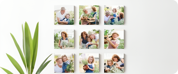
The Classic Grid Layout
The grid arrangement is the most recognizable way to display square photo prints, and its enduring popularity is rooted in the fact that it works beautifully in almost any room. A grid of equally sized square prints hung with consistent spacing between each piece creates a sense of order and calm that feels both modern and timeless. The visual power of this arrangement comes from repetition and alignment, which draw the eye across the entire composition rather than focusing on any single image. When done well, a grid of square prints reads as one large unified piece of wall art rather than a collection of individual photographs.
To execute a grid properly, consistency is everything. Every print should be the same size, every gap between prints should be identical, and every row and column should be perfectly level. A common mistake is eyeballing the spacing, which almost always results in small inconsistencies that become very obvious once the prints are on the wall. Cut small cardboard spacers to the exact width of the gap you want between prints and use them as guides while hanging. A four-by-four grid of eight-inch square prints with two-inch gaps between each piece creates a stunning focal point on a living room or dining room wall without requiring a large budget or any special tools.
Diagonal Diamond Patterns
Rotating square prints forty-five degrees so they hang as diamonds rather than squares is a simple change that produces a dramatically different visual effect. A row of diamond-oriented prints along a hallway wall or above a staircase feels dynamic and energetic in a way that a standard straight arrangement never quite achieves. The diagonal orientation of the frames catches light differently at different times of day, and the pointed corners of each diamond create a sense of movement and flow that guides the eye naturally along the wall.
This approach works particularly well in spaces that need to feel larger or more active, such as narrow hallways, home offices, or gym spaces. You can arrange diamond prints in a straight horizontal row, a zigzag pattern, or even a cluster that mimics the look of a geometric mosaic. The key technical consideration when hanging diamond-oriented prints is that the hanging hardware needs to be positioned precisely so the frame sits at exactly forty-five degrees. Use a protractor or a phone-based level app to check the angle of each frame before committing the hook to the wall, and always mark your nail positions with a light pencil mark that can be erased afterward.
The Staircase Step Arrangement
Following the natural rise of a staircase with a stepped diagonal line of square prints is one of the most elegant solutions for that notoriously difficult wall space. The ascending or descending line of prints mirrors the angle of the stairs below and creates a visual rhythm that feels completely intentional. Rather than fighting the slanted geometry of a staircase wall, this arrangement works with it, and the result is a display that looks like it was professionally designed specifically for that space.
For the staircase step arrangement, each print should be positioned so its center sits roughly in line with the angle of the staircase handrail. Prints of uniform size work best here because the consistent scale reinforces the rhythmic quality of the stepped line. You can use a single size throughout or try two alternating sizes for a more layered effect. Leave enough space between each print that the arrangement breathes and the individual images can be appreciated, but keep the spacing tight enough that the diagonal line reads clearly as a unified composition rather than a random scatter of frames.
Mixed Size Square Clustering
While using a single consistent print size creates order and uniformity, deliberately mixing several different square sizes within one arrangement introduces visual complexity and a more curated, collected feeling. The key difference between a mixed-size cluster that looks intentional and one that looks disorganized is the careful attention to alignment along certain edges. By ensuring that the tops or bottoms of different-sized prints align on an invisible horizontal line, you can mix four-inch, eight-inch, and twelve-inch square prints in a single arrangement that still feels cohesive.
This method is particularly well suited to displaying a collection of memories from a single event or trip, where images of varying importance can be given different amounts of visual weight through their size. The most meaningful or striking photograph in the collection gets the largest print size and naturally becomes the anchor of the composition. Supporting images fill the space around it in smaller sizes, creating a visual hierarchy that is immediately intuitive to anyone viewing the wall. Sketch your intended arrangement on grid paper before hanging anything, as this saves significant time and prevents unnecessary holes in your wall.
The Panoramic Strip Sequence
Taking a series of square prints that together tell a sequential visual story and arranging them in a tight horizontal strip is a technique borrowed directly from documentary and fine art photography. Each individual print in the strip shows one moment, one detail, or one perspective, and together they unfold across the wall like a visual sentence. This works brilliantly for travel photography where you captured a location at different times of day, or for lifestyle photography that documents a celebration, a family outing, or a seasonal change in your garden.
The visual power of the strip sequence comes from the tension between the contained square format of each individual print and the expansive horizontal sweep of the full arrangement. The eye moves naturally from left to right across the strip, reading the images in sequence the way it reads lines of text. Keep the gap between prints in a strip sequence very narrow, ideally no more than one inch, so the sequence reads as a continuous narrative rather than a set of isolated images. Mounting all the prints at exactly the same height is essential, and using a long spirit level stretched across several prints at once ensures perfect alignment without measuring each frame individually.
Framed Within Framing Technique
One of the most sophisticated ways to display square photo prints is to arrange a group of smaller prints within a larger painted or wallpapered rectangle on the wall, so the prints sit inside a deliberately created visual boundary. Paint a large rectangle on your wall in a contrasting color or apply a section of removable wallpaper, and then hang your square prints centered within that boundary. The painted rectangle acts as an oversized mat around the entire arrangement, giving the collection a gallery-within-a-gallery quality that looks strikingly professional.
This technique elevates a simple collection of prints into something that feels architecturally intentional. The boundary you create does not have to be a solid color rectangle. It could be a thin painted border line, a section of geometric wallpaper, or even a series of decorative moldings that frame the arrangement. The important thing is that the boundary is clearly larger than the print arrangement and leaves a generous visual margin on all sides between the outer edge of the frame and the innermost prints. This margin is what creates the matting effect and makes the whole composition read as a single deliberate installation.
The Asymmetric Organic Scatter
Not every wall arrangement needs to follow a strict geometric logic, and sometimes the most visually interesting results come from deliberately breaking the rules of symmetry and alignment. The organic scatter approach arranges square prints at varied heights, with inconsistent gaps between them and occasional slight tilts in different directions. Done carelessly, this looks messy. Done with intention, it looks effortlessly stylish and creates the impression of a wall that has been collecting memories over years rather than being installed in a single afternoon.
The secret to making an asymmetric scatter look intentional rather than chaotic is to maintain certain invisible constraints while breaking others. Keep all prints within a loosely defined rectangular zone on the wall so the arrangement has an overall shape even if the internal logic is irregular. Vary the heights but keep the range within about twelve inches so nothing feels stranded. If you tilt any frames, tilt them all by roughly similar small angles rather than mixing dramatically different tilts. The overall impression should be relaxed and personal, like the walls of a creative studio or a much-loved family kitchen that has been lived in for years.
Color-Grouped Thematic Walls
Sorting your square photo prints by their dominant colors and grouping them accordingly before arranging them on the wall produces a result that looks more like contemporary color field art than a traditional photo display. This approach treats the photographs less as individual memories and more as visual building blocks whose color values contribute to an overall palette across the wall. A section of warm amber and golden tones on one side might gradually transition into cooler blues and greens on the other, creating a sunset-to-ocean shift that transforms your collection into an immersive color experience.
To plan a color-grouped arrangement, spread all your printed photos on a large table and sort them by their dominant hue before you decide on positions. You may find you need to reprint certain images or add new ones to fill gaps in your color sequence, and doing this planning stage on the table rather than on the wall saves enormous time. The final result is most impactful when the color transition is gradual and the individual prints within each color zone vary in tone from light to dark, creating depth and dimension within each section. This method works best with a large collection of at least twenty prints and plenty of wall space.
The Statement Single Row
Sometimes restraint is the most powerful design choice available, and a single horizontal row of square prints hung at precisely the same height along a long wall is one of the cleanest and most impactful ways to use photography in an interior space. This arrangement suits modern and minimalist interiors particularly well because it respects the clean geometry of the room rather than competing with it. A long row of square prints along a hallway, above a sofa, or behind a dining table has an elegant, gallery-like quality that draws the eye along the entire length of the wall.
The success of a single row arrangement depends entirely on precision in execution. Every print must be exactly level, the spacing between each print must be perfectly consistent, and the height of the row must be chosen thoughtfully in relation to the furniture or architectural features below it. The traditional guideline of centering art at eye level applies here, but in practice the row often looks better when it sits just above the top of the sofa or just below the ceiling molding, anchored by the surrounding architecture. Use prints of identical size for the cleanest result, or alternate two sizes in a consistent pattern for a row that has rhythm without feeling rigid.
Layered Ledge Display Method
Rather than hanging square prints directly on the wall with nails and hooks, installing one or more picture ledges and leaning prints against the wall creates an entirely different quality of display. Picture ledges are shallow wooden shelves specifically designed for displaying framed art, and they allow you to arrange, rearrange, and swap prints as often as you like without adding new holes to your wall. Leaning prints rather than hanging them gives the arrangement a relaxed, changeable quality that feels current and lived-in.
The layered quality of a ledge display comes from overlapping prints of different sizes at slightly different depths, with taller prints leaning at the back and smaller prints propped in front of them. You can mix square photo prints with other objects like small plants, ceramic pieces, or books to add dimension and prevent the ledge from feeling like a flat two-dimensional display. When arranging prints on a ledge, vary the heights of individual prints by propping some on small risers or books hidden behind other objects. This variation in height gives the arrangement a natural, uncontrived quality that is difficult to achieve with wall-hung prints alone.
Conclusion
The ten approaches covered in this article are not rigid formulas but starting points for your own experimentation. Each method has a distinct character, and the best choice for any particular wall depends on the architecture of the room, the nature of your image collection, the furniture and other elements in the space, and your own personal aesthetic. Some people will feel drawn to the clean precision of a perfect grid, while others will prefer the warmth and personality of an organic scatter or the changeable flexibility of a ledge display. There is no single correct approach, and mixing elements from different methods often produces the most interesting results.
What all ten approaches share is the principle that intentionality is what separates a beautiful wall from a cluttered one. The same prints arranged carelessly look like an afterthought, while the same prints arranged with care and planning become the defining visual feature of the room. Taking the time to sketch your arrangement, cut spacing guides, use a spirit level, and plan your color and size distribution before making a single hole in the wall will always produce a better result than improvising as you go.
Square photo prints have a particular advantage in all of these arrangements because their equal dimensions make them naturally harmonious with each other. Unlike rectangular prints, which can feel awkward when mixed in different orientations, square prints combine easily in any configuration without the composition feeling unresolved. This consistency makes them forgiving for beginners and endlessly flexible for more experienced decorators who want to push the boundaries of what wall art can look like.
Beyond the purely visual considerations, there is something deeply meaningful about surrounding yourself with printed photographs. Screens display images temporarily, but a printed photograph on a wall becomes a permanent fixture of the space where your daily life unfolds. The images you choose to print and display reflect what matters to you, who you love, where you have been, and what you find beautiful. Investing time and care in how those images are displayed is not a superficial concern but an act of respect for the memories and moments they represent.
As your collection grows and your taste evolves, do not be afraid to change your arrangements. The ledge display method in particular invites this kind of ongoing curation, but even wall-hung arrangements can be refreshed by rotating prints, adding new ones, or completely reimagining the composition. Your walls do not need to be finished and fixed. They can be living, evolving expressions of who you are and how you see the world, and square photo prints are one of the most accessible and beautiful tools available for that ongoing act of self-expression.