
Celebrate Your Story on Canvas – One Memory at a Time
Whether it's a milestone, a memory, or a simple joy, we’re here to make it a lasting part of your home.
-

Add Photos
-

We Deliver
-

You Stick


Or Select From Our Wide Range of Collections
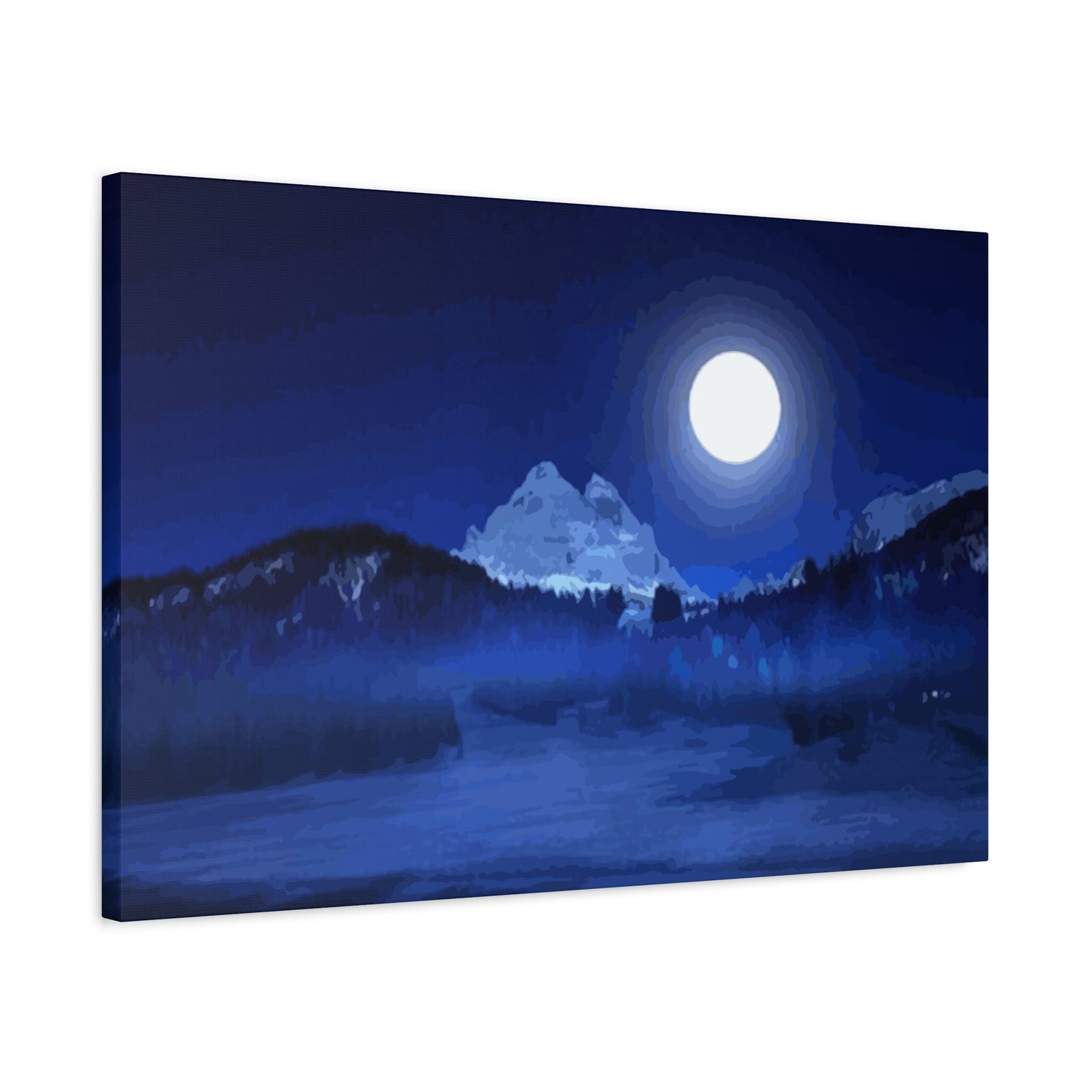
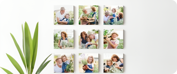
Turn your favorite phone pics into prints that stick and restick.
They’re removeable, reusable, and leave no marks.
How it Works
-

1
Upload a photo or choose from our canvas
-

2
The art is printed and shipped to you

Happiness Guaranteed

Reviews That Made Our Day
Up to 40% off + Free Shipping
“I was impressed with the quality of the canvas prints from Prints4Sure. The colors are vibrant, and the image clarity is excellent—true to what I uploaded. The materials feel durable, and they arrived in perfect condition.”

“I love that I can rearrange them without damaging my walls, and they’re perfect for renters or anyone looking for a hassle-free personal story décor solution. They adhere well and are easy to reposition."
“I wanted to create a keepsake for my grandparents’ 50th wedding anniversary. I uploaded a photo from their wedding day and added one from a recent family gathering for a ‘Then and Now’ theme. The detail was beautiful, and it was so clear despite the older photo."
“I recently got married, and my husband and I ordered a large canvas of our favorite wedding photo from Prints4Sure. When it arrived, I almost cried—everything looked stunning, from the clarity of our faces to the warmth of the colors."
-

Rated 4.9 on the Appstore
Based on 80,000+ Reviews
-

-

Rated Excellent on Trustpilot
Based on 10,000+ Reviews


Choosing the Perfect Wall Art Prints: A Guide to 6 Popular Styles
Wall art prints have the remarkable ability to transform any room from a plain, unremarkable space into something that feels curated, personal, and alive. The right print does not just fill an empty wall. It sets the mood of an entire room, communicates something about the people who live or work in the space, and can even influence how comfortable and inspired you feel in your daily surroundings. With so many styles, subjects, and formats available today, the process of choosing wall art prints has become both an exciting creative opportunity and, at times, an overwhelming one. Knowing where to start and what to look for makes all the difference.
This guide is designed to help you cut through the noise and make confident, informed choices about wall art prints for your home or workspace. Rather than offering generic advice about what looks good, it dives into six of the most popular print styles available today, explaining what makes each one distinctive, which spaces they suit best, and how to style them effectively. Whether you are drawn to the timeless elegance of botanical illustrations, the bold energy of abstract art, or the quiet intimacy of black and white photography, this guide will help you find the perfect prints for your walls.
Botanical Prints Bring Nature Indoors
Botanical prints have enjoyed enduring popularity for centuries, and their appeal shows no sign of fading. Rooted in the scientific illustration traditions of the 18th and 19th centuries, botanical art originally served as a way to document plant species with precision and detail. Today, these prints are valued not for their scientific accuracy but for their elegant beauty and the sense of calm they bring to interior spaces. From delicate watercolour florals to detailed pen-and-ink studies of tropical leaves, botanical prints span a wide aesthetic range while maintaining a consistent connection to the natural world.
One of the reasons botanical prints work so well in so many different rooms is their versatility. A single large botanical print of a monstera leaf or a vintage rose study can anchor a living room wall with quiet confidence. A series of smaller botanical prints arranged in a grid brings a structured, gallery-like feel to a hallway or staircase. In kitchens and dining rooms, herb illustrations or fruit studies add a thematic connection to the space without feeling forced or overly decorative. Botanical prints pair well with natural materials like wood, linen, rattan, and terracotta, making them a natural fit for Scandinavian, bohemian, and cottagecore interior styles.
Abstract Art Adds Bold Visual Energy
Abstract art prints are among the most impactful choices you can make for a wall, offering colour, movement, and emotion in a format that does not require literal interpretation. Unlike representational art, abstract prints communicate through shape, line, texture, and colour rather than through recognisable subjects. This quality makes them uniquely flexible, as the same print can evoke completely different feelings in different viewers and suit a wide range of interior contexts depending on the colours and composition involved.
When choosing abstract art prints, the most important consideration is colour. An abstract print with warm tones of terracotta, ochre, and blush will bring warmth and energy to a neutral room, while one featuring cool blues, greys, and whites creates a calm and sophisticated atmosphere. Large abstract prints work exceptionally well as statement pieces above a sofa, bed, or fireplace, where their size and visual complexity can be appreciated from a comfortable viewing distance. Smaller abstract prints work well in groupings, where the interplay between different compositions creates a dynamic and layered display. Abstract art suits contemporary, minimalist, and mid-century modern interiors particularly well.
Black and White Photography Prints
Black and white photography prints carry a timeless, documentary quality that colour photography sometimes cannot replicate. Stripping away colour forces the viewer to focus on form, light, shadow, and composition, often revealing an emotional depth and visual clarity that feels more raw and immediate than colour imagery. Whether the subject is a sweeping urban skyline, an intimate portrait, a stretch of empty coastline, or the geometric patterns of an architectural facade, black and white photography has the ability to make familiar subjects feel newly significant.
From a styling perspective, black and white photography prints are among the easiest wall art choices to work with because they are inherently neutral. They complement virtually any colour scheme without clashing, making them ideal for rooms where the palette is already complex or likely to change over time. A large black and white landscape print gives a bedroom a calm, meditative quality, while a series of candid street photography prints brings an urban, journalistic energy to a home office or studio space. Black and white prints also pair beautifully with both light and dark frames, giving you flexibility in how you present and hang them throughout your home.
Vintage Map Prints for Timeless Character
Vintage map prints occupy a unique position in the world of wall art because they combine aesthetic beauty with personal and historical significance. An antique-style map of a city you love, a country you have visited, or a region that holds personal meaning becomes more than decoration. It becomes a conversation piece, a record of somewhere that matters, and a reminder of experiences and connections that shaped who you are. The aged, sepia-toned aesthetic of vintage cartography adds warmth and intellectual character to any room it inhabits.
Vintage map prints work particularly well in home libraries, studies, and living rooms where a sense of worldliness and curiosity is part of the desired atmosphere. They suit traditional and eclectic interior styles that embrace history and craftsmanship, though a well-chosen map print can also add unexpected character to a more contemporary space. Framing is especially important with vintage maps. Deep wooden frames, antique gold frames, or simple black frames with wide white mounts all complement the aged aesthetic effectively. For a more immersive display, a large floor-to-ceiling map print or a collection of maps from different eras hung together creates a striking focal point.
Minimalist Line Art Prints
Minimalist line art has become one of the defining print trends of recent years, and its popularity is entirely understandable. These prints distil a subject down to its essential outlines, using a single continuous line or a series of simple strokes to suggest a face, a figure, a flower, or an abstract form. The result is something that feels both effortlessly simple and quietly sophisticated, capable of adding personality and visual interest to a wall without competing with other elements in the room.
The appeal of minimalist line art lies partly in its restraint. In a world of visual noise and information overload, a simple line drawing on a white background offers a moment of visual breathing space. These prints suit minimalist and Scandinavian-inspired interiors particularly well, where the emphasis is on clean lines, functional design, and thoughtful curation. They also work beautifully in spaces that are already richly decorated, providing a calm counterpoint to busier elements. Minimalist line art prints are widely available at accessible price points, making them an excellent starting point for anyone who is new to collecting wall art or who wants to refresh their space without a significant investment.
Typography and Quote Prints
Typography and quote prints are one of the most personal categories of wall art because the words you choose to display in your home say something direct and deliberate about your values, your sense of humour, and the way you want to feel in your own space. From a single meaningful word rendered in elegant calligraphy to a full passage of text set in a clean sans-serif typeface, typography prints range from the deeply sentimental to the quietly witty, covering every emotional register in between.
The key to using typography prints effectively is restraint and intention. A single, well-chosen quote displayed in a prominent position carries far more impact than several competing text prints cluttering the same wall. Consider the typeface carefully, as the font used to display a message is as important as the words themselves. Ornate script fonts suit romantic and traditional interiors, while bold geometric typefaces feel more at home in industrial or contemporary spaces. Placement matters too. A motivational print in a home office or gym can provide genuine daily inspiration, while a warm, welcoming phrase in an entryway sets the tone for everyone who enters your home.
Mixing Different Print Styles Together
One of the most common concerns people have when choosing wall art is whether different print styles can be combined in the same space. The answer is that mixing styles is not only acceptable but often produces the most interesting and personal results. A gallery wall that combines botanical prints, abstract art, and black and white photography feels layered and curated in a way that a wall featuring only one style rarely does. The key is finding unifying elements that tie different prints together into a cohesive whole rather than a chaotic jumble.
Colour is the most powerful unifying tool when mixing print styles. Choosing prints that share even one or two common colours creates a visual thread that connects different subjects and styles without making the display feel too matched or contrived. Frame consistency is another effective strategy. Hanging prints in a variety of styles but within identical or complementary frames immediately makes the grouping feel intentional and considered. Size variation also plays a role, as mixing large and small prints within a grouping creates rhythm and visual movement that keeps the eye engaged as it travels across the wall.
Choosing the Right Frame for Prints
The frame you choose for a wall art print is almost as important as the print itself. A beautiful print displayed in the wrong frame can look diminished or out of place, while a well-chosen frame elevates the print and integrates it seamlessly into the room. The first consideration is whether to use a frame at all. Some prints, particularly canvas prints or unframed poster art, are designed to be displayed without a frame and benefit from the clean, informal look this approach provides.
When framing is appropriate, consider the relationship between the frame material, colour, and the print it will contain. Natural wood frames in light oak or walnut tones suit botanical, photographic, and minimalist prints particularly well, adding warmth without distraction. Black frames are among the most versatile options, working well with almost any print style and providing a clean, graphic edge that suits both contemporary and traditional interiors. Gold and antique metal frames add a sense of luxury and formality that suits vintage maps, classical artwork, and portraits. Wide white or cream mounts between the print and the frame add space and visual breathing room that makes smaller prints feel more considered and gallery-worthy.
Sizing Prints for Different Rooms
Getting the size of a wall art print right is one of the most important factors in whether it will look intentional and well-placed or awkward and out of proportion with its surroundings. In large rooms with high ceilings and generous wall space, a single oversized print can make a dramatic and confident statement that smaller prints would fail to achieve. As a general guideline, the width of a print or grouped display above a sofa or bed should be roughly two thirds to three quarters of the width of the furniture beneath it.
In smaller rooms, the temptation is to choose smaller prints to avoid overwhelming the space, but this approach often backfires. A single large print in a small room can actually make the space feel more expansive by drawing the eye upward and outward, whereas several small prints dotted around a small room can make it feel cluttered and busy. When in doubt, go slightly larger than your instinct suggests and test the sizing by taping paper cut-outs to the wall before committing to a purchase. This simple technique costs nothing and prevents the frustration of ordering a print only to find it looks lost on the wall.
Colour Matching Prints to Room Palettes
Choosing a wall art print that works harmoniously with the existing colour palette of a room requires a little thought but pays off enormously in the finished result. The simplest approach is to select prints that pick up one or more of the colours already present in the room, whether in the furniture, textiles, or decorative accessories. This creates a sense of visual coherence that makes the room feel deliberately designed rather than assembled at random.
For rooms with neutral palettes of white, grey, and beige, almost any print colour will work, giving you maximum creative freedom. In rooms with stronger existing colours, the approach requires more care. Complementary colour pairings, where the print features colours opposite the dominant room colour on the colour wheel, create a vibrant and energetic effect. Analogous pairings, where the print colours sit close to the room colours on the colour wheel, produce a more harmonious and restful result. Neither approach is universally superior, and the choice ultimately depends on the atmosphere you want to achieve in the space.
Where to Source Quality Prints
Finding high-quality wall art prints at a fair price has never been easier, thanks to the wide range of sources available both online and in person. Independent artists selling through platforms such as Etsy, Society6, and Redbubble offer an enormous variety of original designs at accessible price points, and purchasing from independent creators means your prints are likely to be genuinely unique rather than mass-produced designs seen in every home. Many independent artists also offer prints in multiple sizes, allowing you to choose the exact format that suits your space.
Established art print retailers and galleries, both online and physical, offer a more curated selection with consistent quality control and professional printing standards. These sources tend to charge a premium over independent marketplaces, but the quality of paper, ink, and reproduction is often noticeably superior. Auction houses, charity shops, and second-hand markets are also worth exploring for vintage and original prints that carry a history and character that new prints cannot replicate. Wherever you source your prints, always check the paper weight, ink quality, and return policy before purchasing, as these details determine how the print will look and last in your home.
Caring for Wall Art Prints Over Time
Wall art prints, like any investment in your home, benefit from a degree of care and attention to ensure they remain beautiful over time. The most significant threat to the longevity of a print is ultraviolet light, which gradually fades ink and paper regardless of quality. Hanging prints away from direct sunlight and fitting UV-filtering glass or acrylic in frames are the two most effective ways to protect against fading. Museum-quality UV glass is available from most framing specialists and represents a worthwhile investment for prints you particularly value.
Dust accumulation on the surface of prints and frames can be managed with a soft, dry cloth or a gentle brush used regularly. Avoid using damp cloths or chemical cleaners near unprotected prints, as moisture and solvents can cause irreversible damage to paper and ink. In rooms with high humidity, such as bathrooms or kitchens, ensure prints are either specifically produced for those environments or adequately sealed and framed to prevent moisture damage. With basic preventive care, a quality wall art print framed and hung correctly should retain its beauty for many decades.
Conclusion
Choosing the perfect wall art prints for your home is a deeply personal process that combines practical considerations with genuine creative expression. Throughout this guide, we have examined six popular print styles, from the organic elegance of botanical prints and the bold visual impact of abstract art, to the timeless authority of black and white photography, the historical character of vintage maps, the refined simplicity of minimalist line art, and the direct personal statement of typography prints. Each style brings something distinctive to a space, and understanding what makes each one work helps you make choices that you will be happy with for years to come.
Beyond the individual styles themselves, we have looked at the practical dimensions of successful wall art display, including how to mix different styles cohesively, how to choose frames that complement rather than compete with prints, how to match print sizes to the proportions of different rooms, and how to align colour choices with existing interior palettes. These considerations might seem secondary to the aesthetic choice of the print itself, but they are what separate a wall that looks casually assembled from one that feels genuinely considered and complete.
The most important thing to remember as you begin or continue your wall art journey is that personal meaning matters more than trend-following. A print that resonates with you emotionally, recalls a place you love, or simply makes you feel good every time you see it is always the right choice, regardless of whether it is currently fashionable or fits neatly into a prescribed interior style. Your walls are yours to fill with whatever brings you joy, curiosity, and comfort. The six styles covered in this guide offer a generous range of starting points, but the best wall art collection is always one that grows organically from your own tastes, experiences, and the life you are living in your home. Trust your instincts, take your time, and let your walls tell your story.